
Data Tools
Vendo Data Tools (VDT) is a reporting tool developed by our team to ensure that all of our merchants can easily access data, enabling them to make informed decisions that optimize revenue and business strategies.
How to access
Data Tools is accessible through Vendo Backoffice, under the Data Tools section. When the Data Tools section is hovered, a sub-menu is displayed with the available reports.

Available Reports
The Data Tools is composed of the following dashboards and reports:
- Vendo Data Tools: shows the main Key Parameters Indicators in an aggregated form.
- VAT: value-added tax report. It summarizes the payout amount per currency aggregated by site or country.
- Simple Report: shows total count and revenue for accepted and rejected transactions aggregated by transaction type and currency.
- Payments: it allows you to download the latest payout summaries.
- VAMP Report: provides an overview of Visa Monitoring Program Acquirer (VMPA) metrics for your account. It highlights key values and trends to support monitoring and risk management decisions.
Data Refresh
All dashboards have data up to YESTERDAY and only show data for the merchants associated with your account. The data gets updated every day at 5:00 AM Central European Time.
Glossary
All terms used are defined in the Glossary section.
How to read charts
The following section summarises how to read the special charts available in the Dashboard.
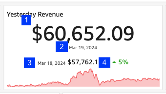
Please check the numbers marked on the image below for each explanation for all cases.
KPI Increase Summary
The chart reads “On 19th of March 2024, the total revenue was 60,652.09 USD, 5% more compared with the previous day, 18th of March 2024”
- Main value of the KPI. In this case, the total revenue
- The date used to calculate the value 1. In this case, 19th of March 2024.
- Date and value used to compare with. In this case, 18th of March 2024, with an amount of 57,762.1 USD.
- Percentage of revenue increase when comparing Value 1 with Value 3.
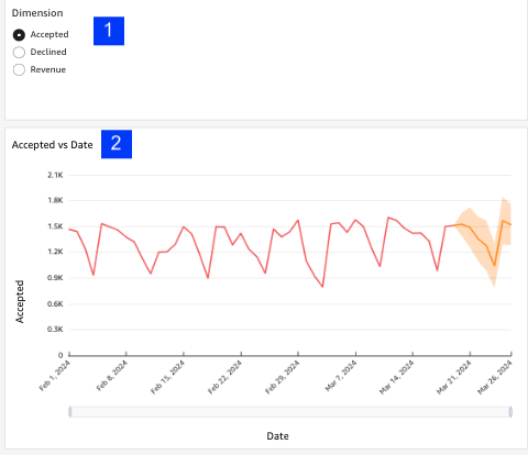
Line chart with forecasting
- A selector is used to change the metric on the y-axis of Value 2.
- Line chart of the selected dimension vs date. The yellow area is the forecast for the next 7 days computed by AI.
Important: if the chart only shows 6 historical points, the forecast will not be computed and it will display a message.
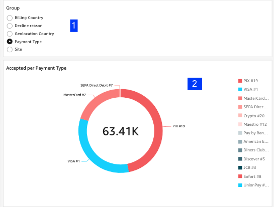
Pie chart with dynamic grouping
- This is a dynamic field. Depending on the selection, the pie chart will be aggregated on one metric or another.
- Pie chart that shows the selected metric (in this case: accepted) vs the grouping selected in Value 1 (in this case, payment type).
Filters
Two types of filters are available in all sheets:
- General filters can be found at the top of the sheet and are used to filter all charts that correspond.
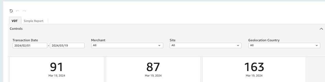
- Specific filters are placed on the sheet and closer to the graph they are intended to filter.
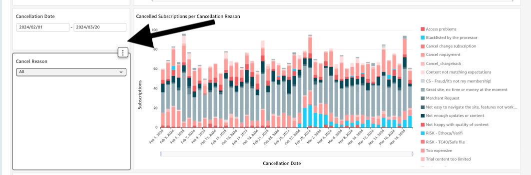
- The example below shows two filters “Cancellation Date” and “Cancel reason” that only affect the “Cancelled subscriptions per Cancellation Reason” chart.
Export
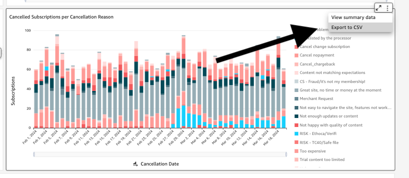
Data under all charts can be downloaded as .csv by clicking on the right-up corner of the chart and selecting export.
Content
Cancellation grouping
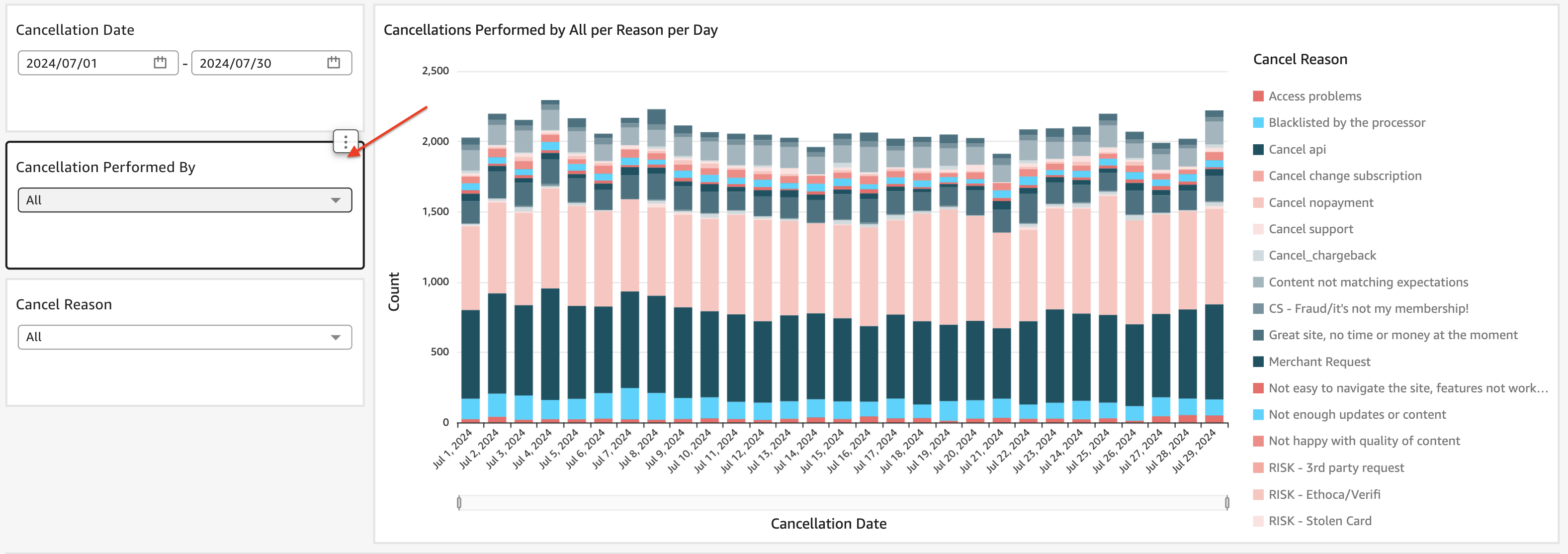
In Vendo cancellations can be performed by 4 entities: Risk, Customer Support, Merchant and End User.
You can filter the cancellations depending on who performed it from the selector located on the left of the chart. To see all cancellations, please select ‘All’, this will show all cancellations without any grouping. Similarly, you can filter the cancellations by the cancellation reason or date.
Contact
In case of doubts or questions on the usage of the report, please contact [email protected]